Probably to most people tend to think that design is necessarily linked to a name or a brand. I believe it’s the other way around. A design can belong to a brand, but basically everything we see has been designed which makes design a concept.

The Math of Nature
Living creatures such as plants, animals and humans have been designed by nature’s evolution. Already in 1202, the Italian mathematician Leonardo Fibonacci released a mathematical model describing the system nature builds leaves, flowers, shells and other thing, known as the «Fibonacci sequence».
The Evolution of Cities
I agree that most cities and even many houses are products of an evolution. Wars and natural disasters destroyed them and people rebuild them «organically». Modern architects have to plan around these structures. Still, they now have a design. After all it is a planned decision (whatever the reasons) which part of the city or buildings remain «old-style» and which ones have to be replaced by a newly planned addition.
Other cities like Brasilia, Chandigarh (India), Manhattan or Canberra have been planned from scratch by urban designers. The streets are numbered and mostly in a rectangular order.
Plans and Maps
If we think of maps – especially of European ones – «design» is not the first thing coming to mind. Although the individual roads are planned, the entire picture looks very organic. A mountain pass is never rectangular and roads typically run along the topography rather than following a ruler.

Genius Is Simplifying Things
Did you ever look at a modern plan of the London Underground, the Métro in Paris or any other modern city? Did you notice that they are all designed according to the same system? I take the liberty to assume that you subconsciously did but never thought about it.
I never noticed this, until I read of Henry Beck (1902-1974). He worked as a technical designer for the London Transport. While the Tube grew larger and larger Mr Beck noticed that the plans grew more confusing with every station, they added to the railway system.

5 Steps to Ingenious Simplicity
Mr Beck was obviously very committed to his job since he searched for remedy to this complication in his spare time. In 1931 he presented to his bosses a schematic plan with the following changes and features
- Instead of drawing the distances between the stations in scale, he choose the same distance between each of them
- The strokes that marked the lines where either drawn horizontally, vertically or in angles of 45 degrees
- He used an individual colour for each line so it was easy to see which line served with station to get the passengers to their destination
- Each station appeared as a short stroke on the map
- Only the stations with an interchange facility were marked with a diamond shape
Clarity wins
Although a bit reluctant, the management of the London Underground decided to give the new schematic plan a try and printed a small amount to be handed out to passengers.
The echo was overwhelming, people loved the clarity of this plan and it soon took over. Other cities used Beck’s design for their public transport systems.
Harry Beck took care of the update of «his» plan until 1960. There is only little difference between Beck’s map from 1931 and the latest one; other than some stations may have been added.

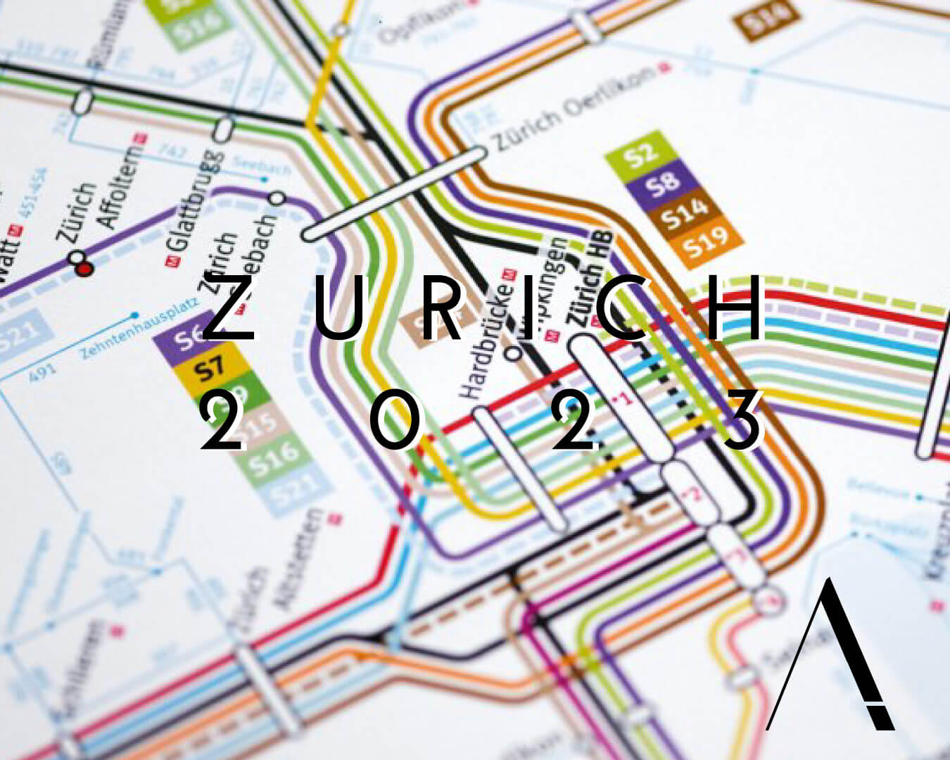
The maps of Zurich’s public transport also are drawn according to Beck’s version
Although Mr Beck says he did not understand much about modern art he had a liking for maps that were as clear as a technical plan.


